LoopMonster
As the project lead and designer, I created LoopMonster, a mobile app that reimagined the loop station experience to make music creation simple and accessible. By transforming complex sound layering into an intuitive, visual interface, users could record, mix, and share loops directly from their phones. What began as an experimental prototype evolved through iterative simplification and was launched on the App Store in 2012.

My first ever project!
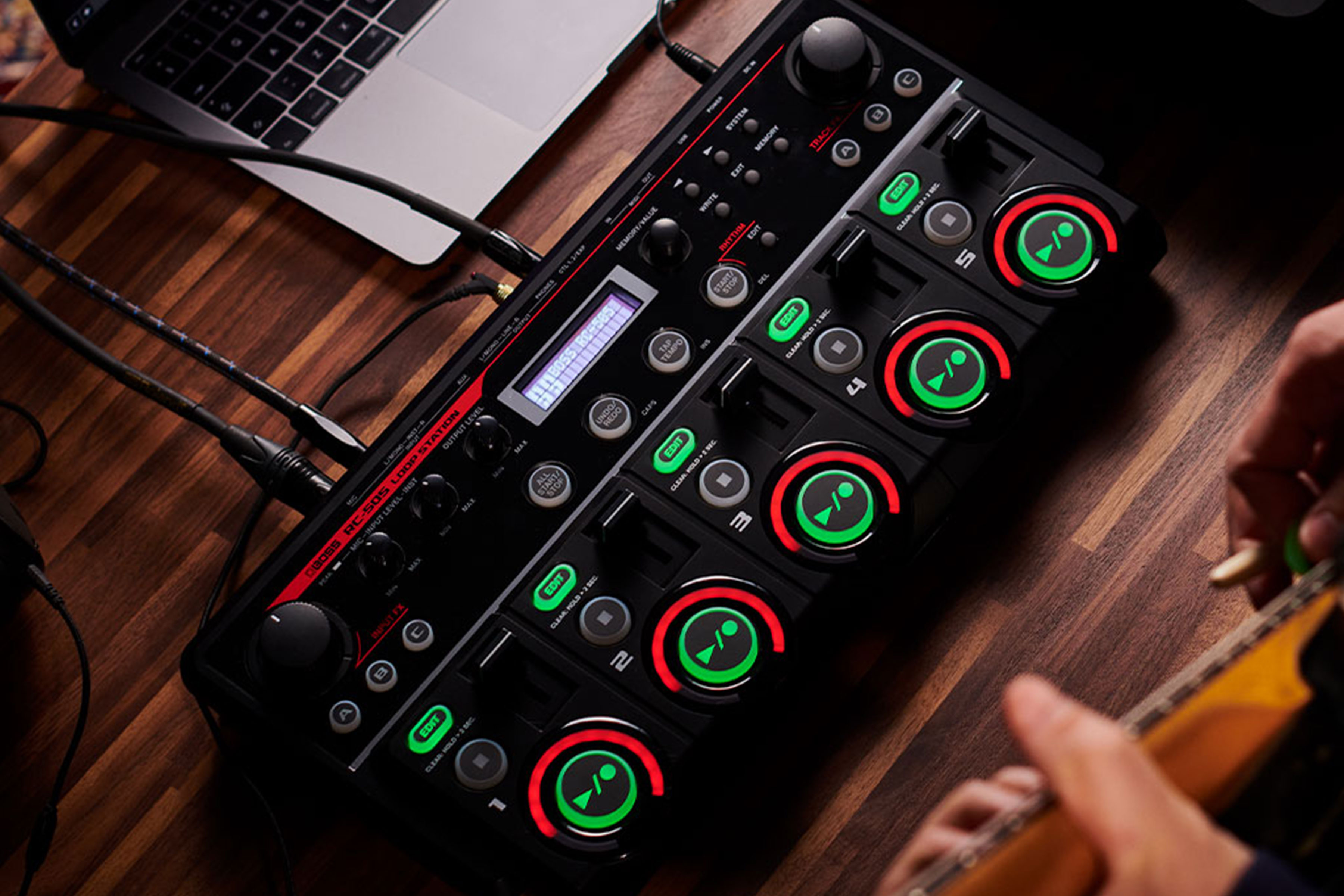
LoopMonster was born in 2011 during the early days of my first startup, BAD (Best App Developers) Company, as we brainstormed ideas for our first product. Having always been fascinated by music, I was inspired after watching a live loop station performance — where layered recordings of simple sounds like claps or drum beats gradually build into a complete track. It was a beautiful form of musical expression, yet one that remained out of reach for most people due to the cost and complexity of the hardware. Influenced by Steve Jobs and Apple’s vision of the intersection of technology and liberal arts, I saw an opportunity to bring that creative experience to everyone through a simple, mobile app.
Designing a visual music experience
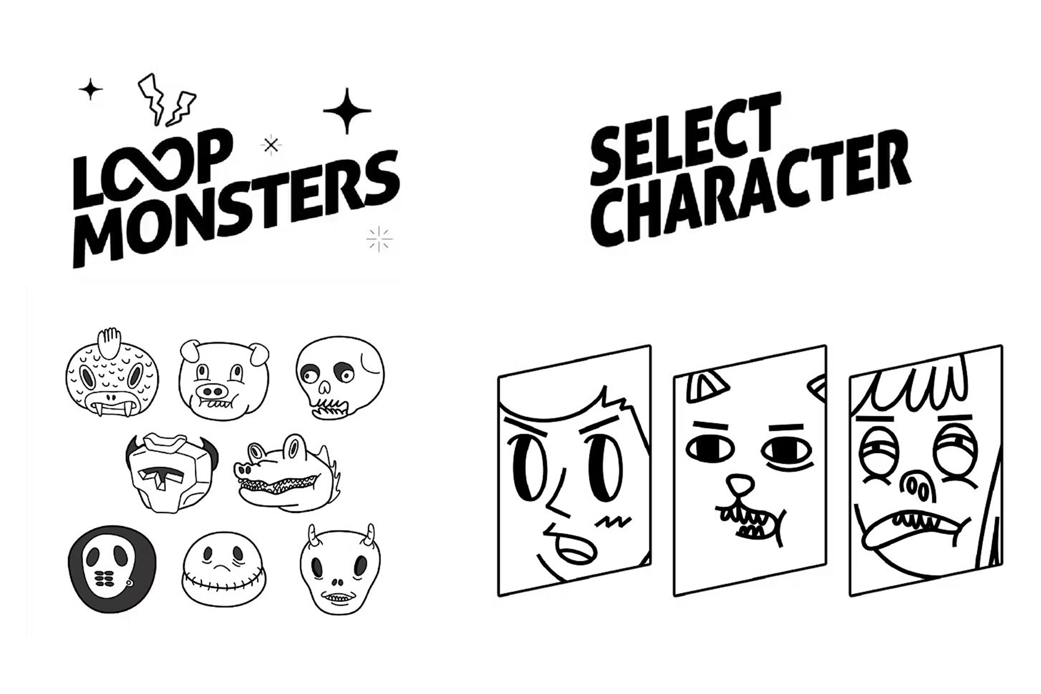
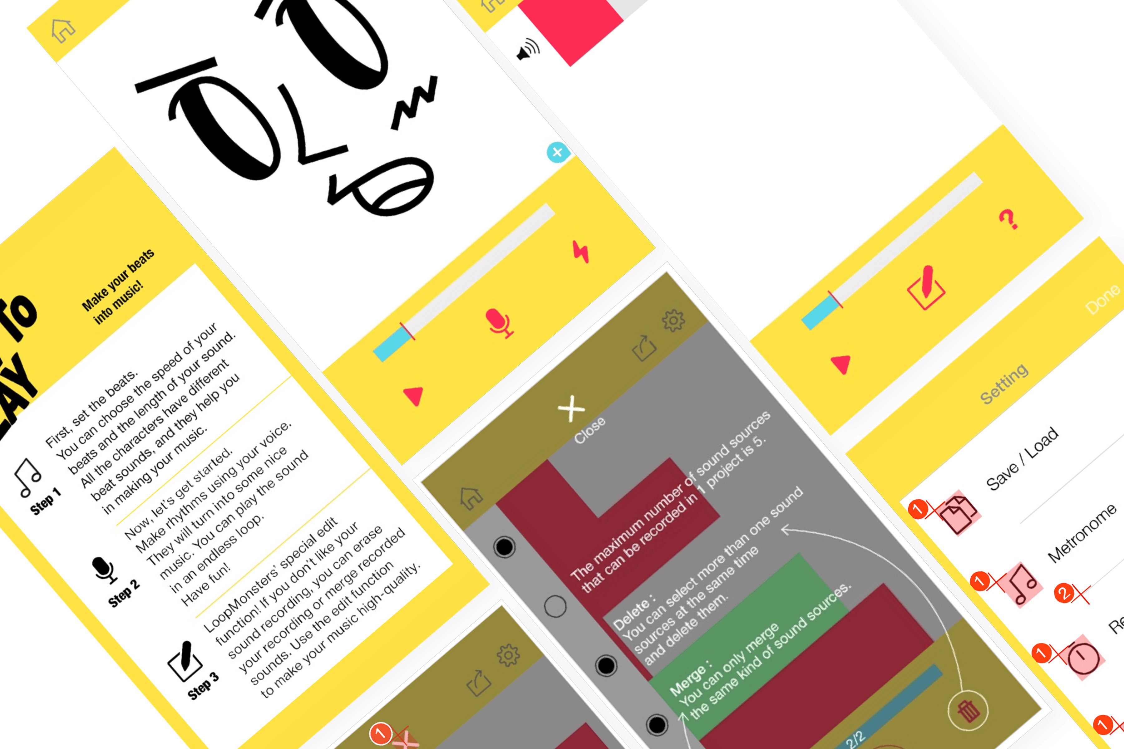
The main challenge was translating the concept of a loop station—recording and layering short sound loops—into a simple, visual, and engaging mobile experience. Our vision was to democratize music creation, so accessibility became our top priority. We wanted an interface that even children could intuitively understand. To achieve this, we personified each sound loop as a friendly “monster,” giving the app its name, LoopMonster.
While traditional loop software relied on intimidating sound-wave graphics, we replaced them with animated 2D characters that moved dynamically to the rhythm and intensity of each sound. This approach transformed abstract audio layers into a playful, tangible experience—making music creation feel less technical and more emotional.
Iterating through user feedback
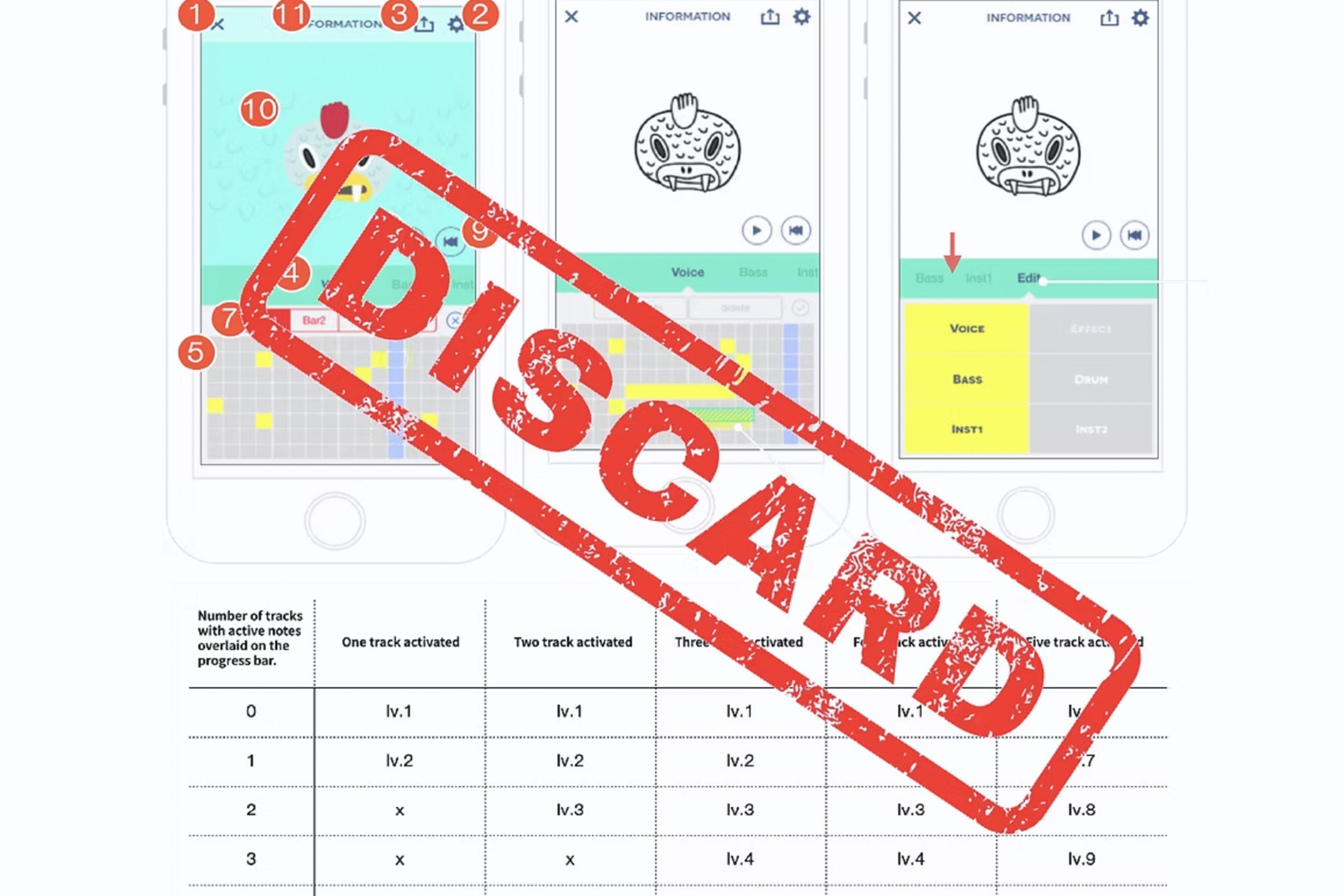
After defining the character concept, our team spent nearly six months experimenting with different UI layouts. Our first approach combined an animated character at the top of the screen with a drum-pad interface below, where each tile represented a different sound. Users could tap tiles to create rhythms, record their own voices, and drag and drop sound clips to arrange loops along a progress bar.
While the system was technically functional, early testing with friends and colleagues revealed a clear problem: it was too complicated to use. We had overloaded the screen with features—up to eleven buttons and multiple gestures—trying to let users create any sound imaginable. But in doing so, we had lost the simplicity we originally aimed for.
Realizing this, we made the difficult decision to start over. We learned that democratizing music creation isn’t about adding features—it’s about removing barriers. This turning point taught us the value of lean, user-driven design and the importance of finding the right balance between functionality and clarity.
"Less is more."
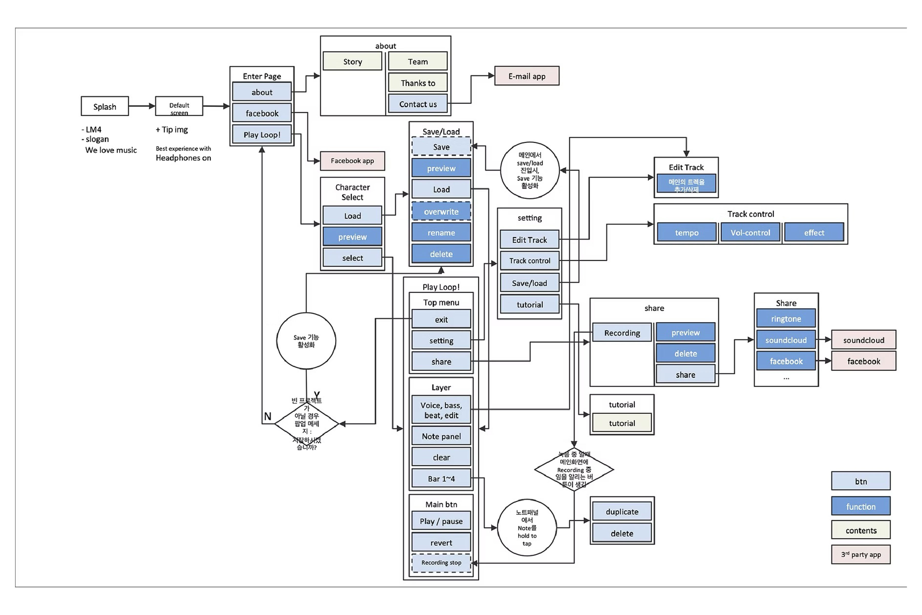
In our second attempt, we focused entirely on simplicity — embracing the philosophy that “less is more.” We merged our previously split screens into a single, unified interface and stripped away most of the unnecessary functions. During interviews, we also discovered that many users felt uncomfortable hearing their own voice repeated. Adding complex editing tools would have gone against our new design direction, so we searched for a simpler solution.
Inspired by the iPod Shuffle, a device that embodied minimalism by removing the screen altogether, we introduced random voice effects — altering pitch or tone depending on the chosen character. This playful element turned user embarrassment into engagement and became one of the app’s most beloved features after launch.
We also simplified editing through intuitive multi-touch gestures, allowing users to control volume or activate and mute tracks directly within a single view. By narrowing the experience to the essentials — recording, looping, and editing — we transformed the traditionally complex loop station into a tool that felt fun, personal, and effortlessly accessible.
Reflection
Even today, I still use “Loop Monster” as my social media nickname. Though the app was released over fourteen years ago (Now is 2025), it continues to hold deep meaning in my life. At nineteen, I was a college dropout searching for something I truly wanted to do. Working part-time at a phone shop, I discovered the iPhone 3GS — and through it, the world of Apple and Steve Jobs. For the first time, I felt a clear sense of purpose.
I gathered a few like-minded people online and founded a small startup called BAD Company — short for Best App Developers. (The name wasn’t meant to sound rebellious, though it was cheekily inspired by Mark Zuckerberg’s “I’m CEO, bitch” business card.) LoopMonster became our very first product. I taught myself design and UX through trial and error, and after a year of late-night coding sessions, we launched the app as a paid download. At its peak, it sold over 30,000 copies in a single day, reaching users around the world and even being featured in several European countries as one of the year’s top entertainment apps.
Beyond the excitement of seeing thousands enjoy our creation, the project taught me invaluable lessons — how to lead a team, listen to feedback, and design with vision and purpose. It was my first step toward understanding what it truly means to create something meaningful. LoopMonster wasn’t just an app; it was where my life as a designer began.

